If you haven’t read them already, you may want to read this post about GWP and this post about GTP first.
Both Global Warming Potential (GWP) and Global Temperature Potential (GTP) were designed for a relatively straightforward goal: to enable the comparison between different greenhouse gases. For example, if someone releases a one-time ‘slug’ of methane into the atmosphere, how much impact on climate will it have compared to the release an equivalent mass of carbon dioxide.
As this post and this post discuss, even this relatively simple question is not easy to answer because the different gases have different radiative efficiencies as well as different lifetimes. One equation, two unknowns.
Now, though, consider how difficult it is to evaluate the impacts of ongoing emissions, like the methane that comes from a herd of cattle, year after year after year.
One option is to simply treat each year’s emissions as a separate event and use GWP to evaluate the impacts. In fact, that is what has been done for many years. Take a look at the graph on the top, though, labeled ‘Concentration vs Time.’
Suppose that you owned a major international beef or dairy company and that all combined, your cattle had been emitting one megatonne of methane a year.
One day you decide double the size of your operations. This would bump up the amount of methane emitted by one megatonne, so that now you are emitting two megatonnes annually. To visualize this scenario, set the values as follows if they are not there already:
- MtCH₄ at start: 1
- Change in MtCH₄ emissions: 1
- Years: 100
The solid green line represents the change in concentration of methane in the atmosphere that your operation will create. See how it climbs rapidly at first, then levels off after a few decades?
Compare that to what would happen if you were to do the same thing with equivalent quantities of carbon dioxide molecules, represented by the dotted light blue line. Because carbon dioxide has such a very long lifetime, the concentrations continue to climb for thousands of years.
Why are they so different? Think of a Ferris Wheel with little methane molecules as the riders. When the ride first opens and begins rotating, the number of riders on the wheel continues to rise. But after the wheel has made one full rotation, the number of people getting on is balanced by the number of people getting off—the number of riders stays constant.
For methane, one full rotation of the wheel takes a few decades. For carbon dioxide, it takes millennia. That dotted blue line will level off eventually, but not for a very long time.
Now back to your very large cattle operation. After that increase, you are emitting two megatonnes of methane every year. If we were to use the standard GWP-100 method to calculate your impact, we would multiply each year’s emissions by 29.8. Each year you would have to announce that you had released the equivalent of 59.6 megatonnes of carbon dioxide.
But is that really fair? Does it even do a good job of representing your impact? Based on that top chart, it doesn’t seem so.
Which is why, around 2016, some climate scientists began developing a new metric that they now call GWP* (pronounced ‘GWP star’). Their goal was to create a metric that would better represent the impacts of what they call short-lived climate forcers (SLCFs) like methane.
The effort began with the powerful computer models that so much climate science is based on, so called earth system models (ESMs). With these models it is possible to ask what effect an emission scenario will have on future temperatures.
With these data in hand, the scientists then sought to create and parameterize a simple formula that would allow people to project the impact of SLCFs like methane without having to run one of those incredibly computer-intensive ESMs.
The exact formula for calculating GWP* has changed somewhat over the years, but in general, it depends on the idea that greenhouse gases can be divided into ‘flow’ and ‘stock’ pollutants. Under this framework, SLCFs like methane are mostly flow pollutants because the concentration depends on the flow of methane into the atmosphere.
Carbon dioxide and other long-lived climate forcers (LLCFs), on the other hand, are stock pollutants because once they get into the atmosphere they stay there for a very long time.
With that concept in mind, let’s look at the formula for calculating GWP*. Here I have used the equation that is oddly buried and written out in a footnote on p. 1016 of AR6 WGI Chapter 7: “To calculate CO2 equivalent emissions under GWP*, the short-lived greenhouse gas emissions are multiplied by GWP-100 × 0.28 and added to the net emissions increase or decrease over the previous 20 years multiplied by GWP-100 × 4.24 (Smith et al., 2021).”
What does that mean? Essentially there are two terms. The first term (emissions*GWP-100*0.28) represents the stock effects of methane. (Yes, I know we just said methane was a flow pollutant, but life is never that simple, is it?) This term serves as an acknowledgment by the GWP* developers that although most of the impacts of a change in methane emissions will occur within a matter of decades, there are some long term (as in centuries) effects as the earth reaches a new equilibrium. In other words, methane acts, in some ways, as a stock pollutant–but only 28% as much as GWP-100 would imply.
To calculate this term you just take the emissions for each year, multiply them by GWP-100, and then apply a steep discount by multiplying it by 28%.
The second term is the flow term. Think of that curve in the first graph showing how rapidly concentrations stabilize at a new level after a change in methane emissions. For 20 years after the change, each year’s emissions are multiplied by GWP-100 and then amplified by 4.24. In other words, it is those first decades, when the Ferris Wheel is not yet full and the concentrations are rising, that really count. (There’s nothing magical about the number 20, it just fits the data well.)
Take a look at the middle chart on the right. The blue line represents GWP*. The red line represents the calculation using GWP-100, and the green line shows the actual emissions. See how the blue line jumps for 20 years and then drops down to 28% of the red line?
Next look at the bottom chart. This represents the cumulative effects of the ongoing methane emissions using the different methods. See how the blue line abruptly slows its rise after 20 years, whereas the green line and the red line do not?
As it turns out, the blue GWP* line provides a pretty good estimation of the warming effects from our ongoing methane emission example.
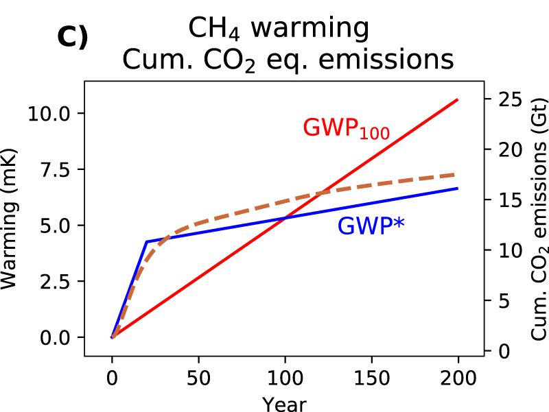
If you are familiar with Python and want to test it yourself, you can test it using a model like FaIR. Otherwise take a look at figure 3C from Lynch et al. 2020, reproduced below. The dashed orange line represents warming. See how closely it follows GWP*?
Recent Comments